S&P 500 Analysis December 2018

In the last post we discussed the recent sell off in the US equity markets. In this post we will dig deeper and see how individual components of the market performed this year.
First we will begin by looking at the components that make up the S&P 500 index and the returns for 2018.
S&P 500 Components
S&P 500 Performance Chart for 2018
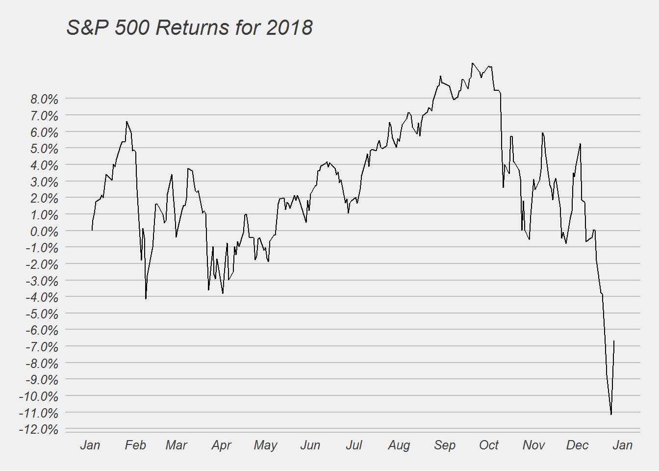
As you can see its been a +10%/-10% kind of a year. Historically this is normal for the market, but what was surprising was the December swoon. December at one point saw 18% sell off. This was the worst December month since the Great Depression. Now things maybe getting bad, but its clearly not as bad as the Great depression or the financial crisis.
We can next look at the different sector performance.
S&P 500 sectors Performance
S&P 500 Sectors performance Charts
## [[1]]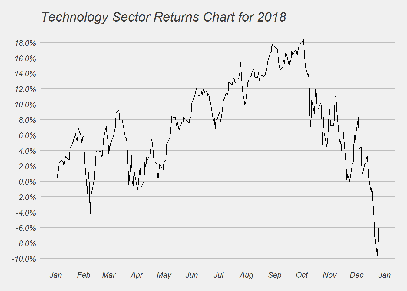
##
## [[2]]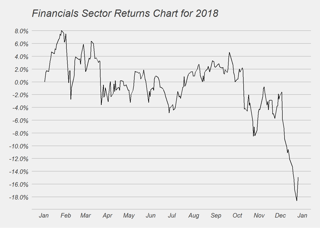
##
## [[3]]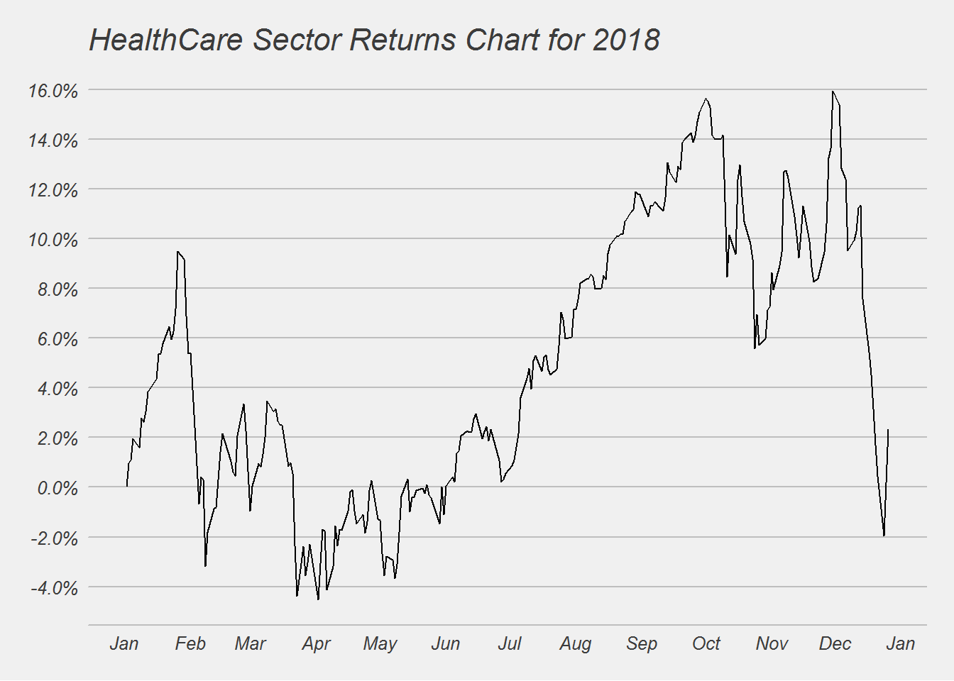
##
## [[4]]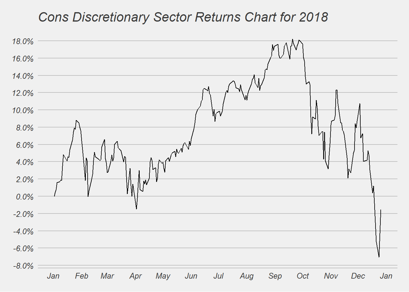
##
## [[5]]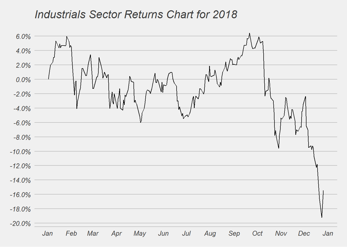
##
## [[6]]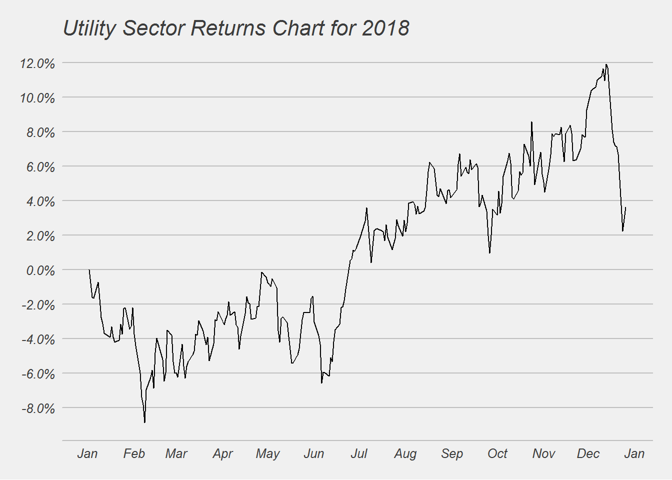
##
## [[7]]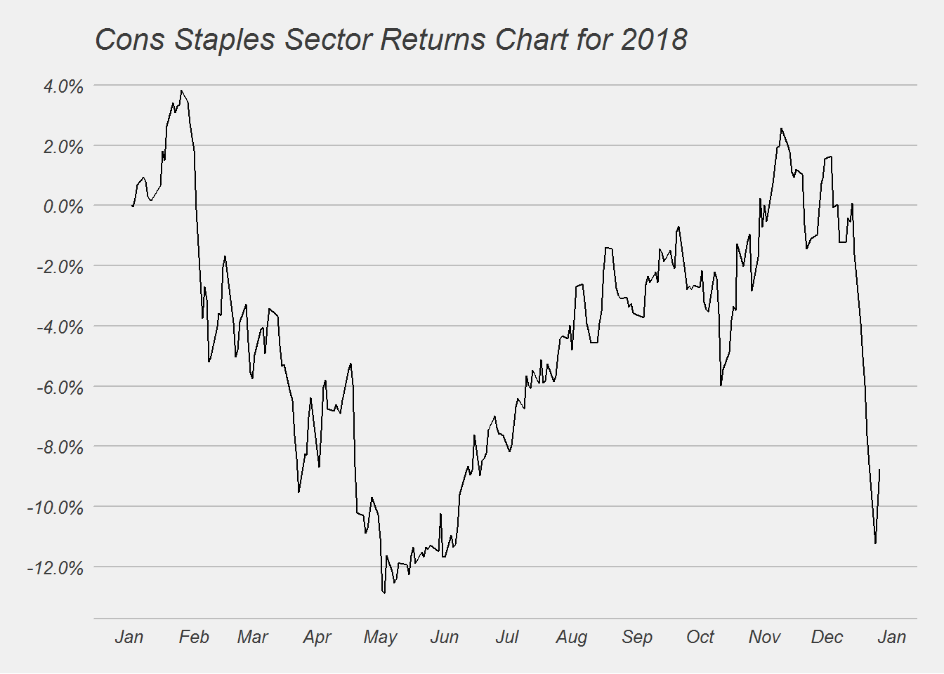
##
## [[8]]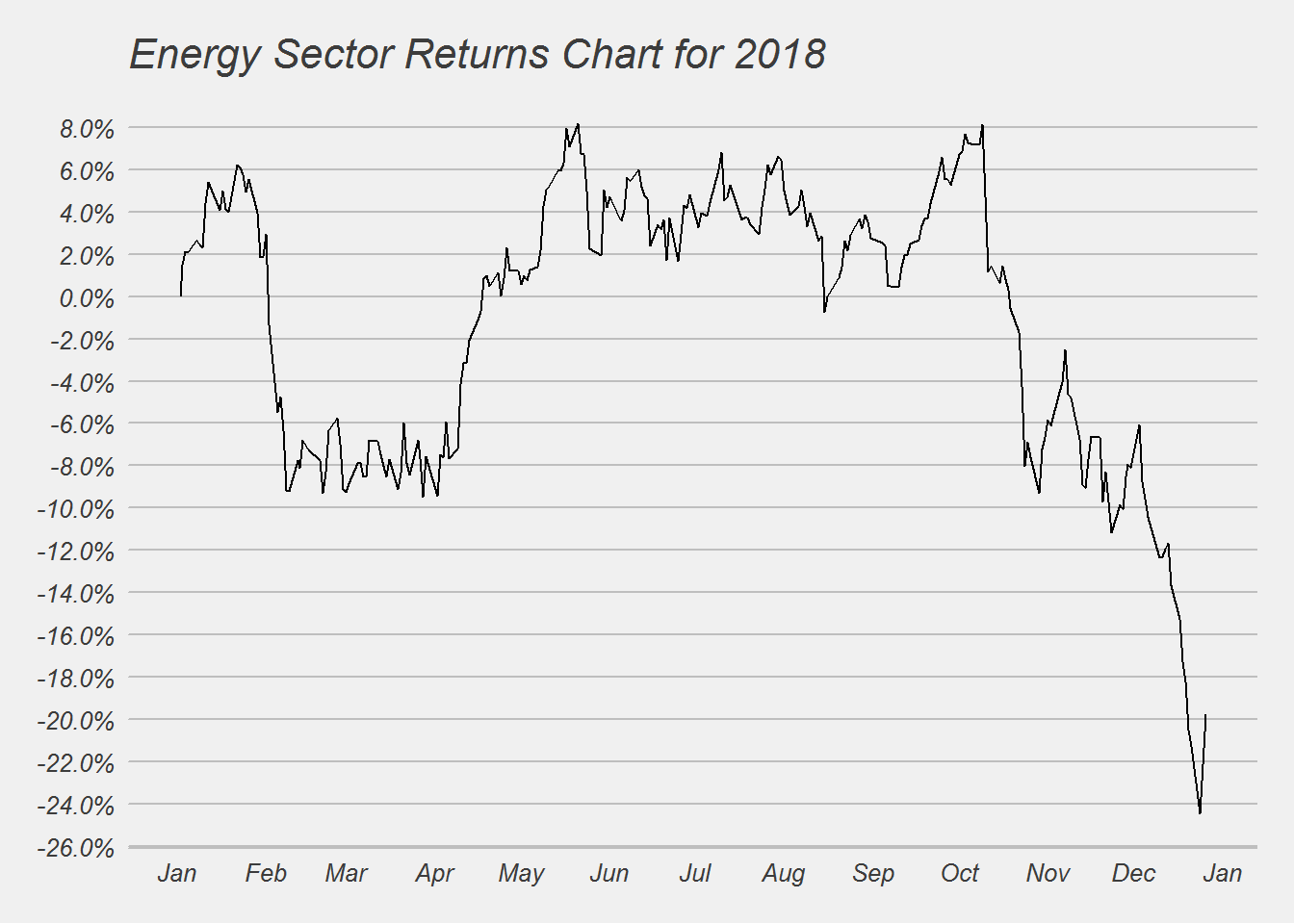
##
## [[9]]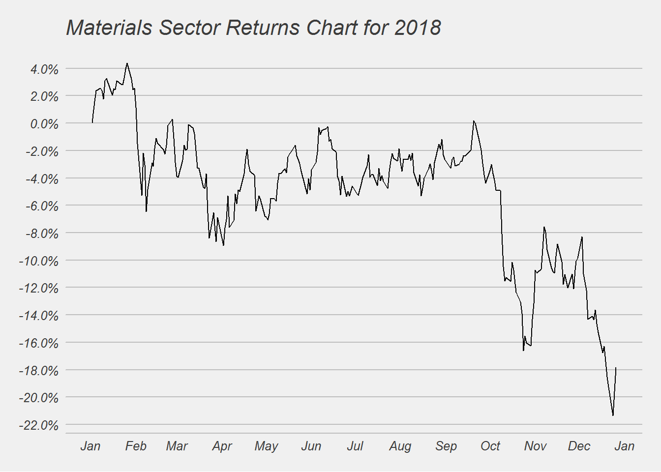
##
## [[10]]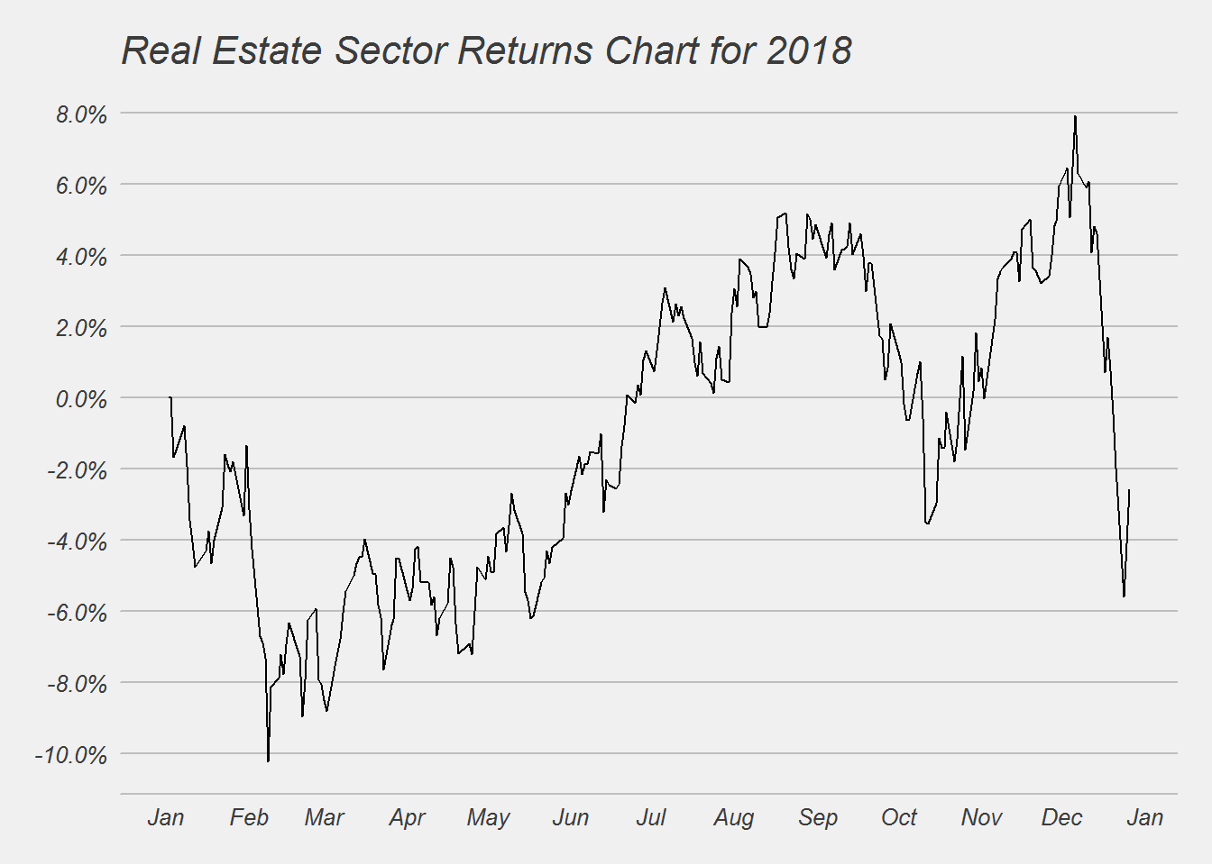
Only 2 sectors (Utility & Healthcare) out of the 10 sectors in the S&P 500 ended positive. Those two sectors are considered safe or recession proof sectors. The worst performance was for the Energy, Materials, Industrial and Financial sectors. Those are more cyclical in nature and maybe pointing to a slowdown in the overall economy.
Individual Stocks
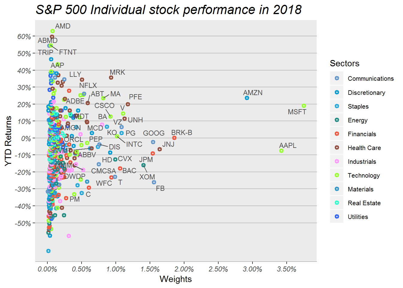
This chart may appear busy, because it packs a lot of information. This chart shows the YTD performance for each stock in the S&P 500 index. The Y-axis is the YTD returns and X-axis shows their weight in the S&P 500 index. The different colors are for different sectors. I have only named the symbols of the major stocks that most investor are familiar with.
At a glance we can see there are a lot of green and brown circles in this chart, these are the technology and the healthcare sectors.
Next we will zoom in to take a better look at the stocks smaller weight (less than 20bps) that outperformed this year.
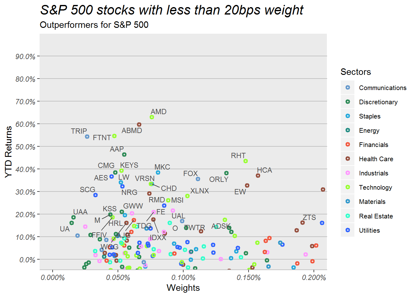
Again we see a lot of technology and utility sector names. But what stands out to us is that the stocks that had a terrible 2017, outperformed the overall markets. We will remember the names of companies that had a terrible time in 2017. Names such as
- Chipotle - food safety issues
- Twitter - low user growth
- Tripadvisor
- Macy’s - Amazon effect
- Kohls - Amazon Effect
- Under Armour - Amazon Effect
- GWW and Auto parts stores such as Orielly and Advance Auto parts - Amazon Effect
So buying the 2017 worst performers seemed to be a great strategy in 2018. Will this work in 2019? If so What stocks performed the worst in 2018. We will see that next.
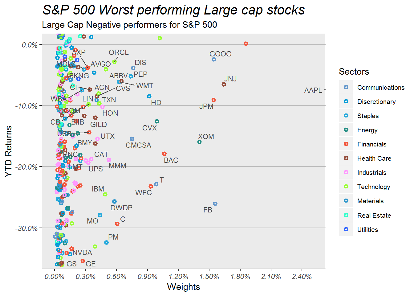
Here we can see Facebook, Goldman Sachs, General Electric, some tobacco stocks, and other major banks. So if someone is looking to bottom pick some stocks, these may be fertile grounds for further research.
Next lets look at the best and worst stocks in the index.
Top 10 and Bottom 10 Performers
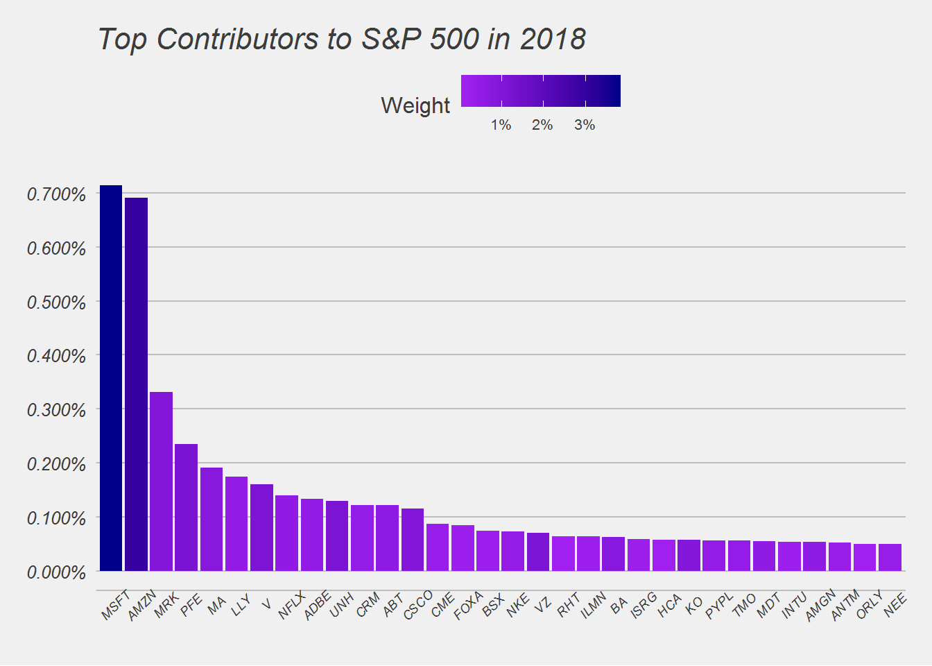
Here we can see that Microsoft & Amazon have been the largest contributors to the S&P index. When we created this chart in August 2018, we saw Apple and Amazon were the biggest contributors. Since Apple stock sold off in October, we have seen a sell off in the overall market. One can point fingers at Apple’s sell-off in bringing down the entire market.
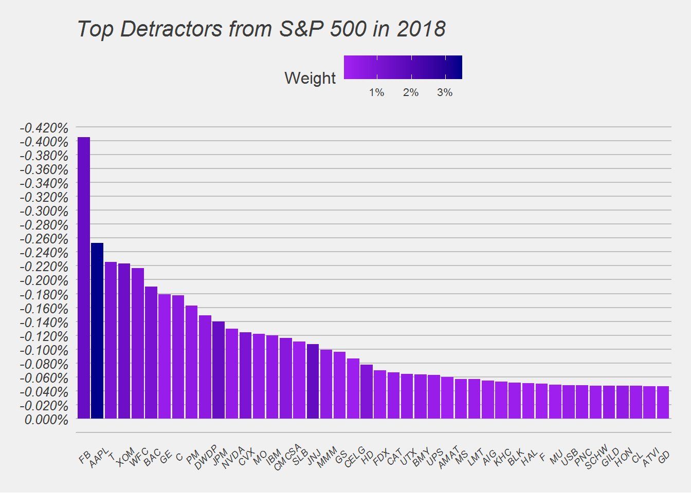
As we said before since October, Apple turned around from the top contributor to the second worst detractor in a single quarter. We also see Facebook and many financial stocks, dragging the S&P 500 lower.
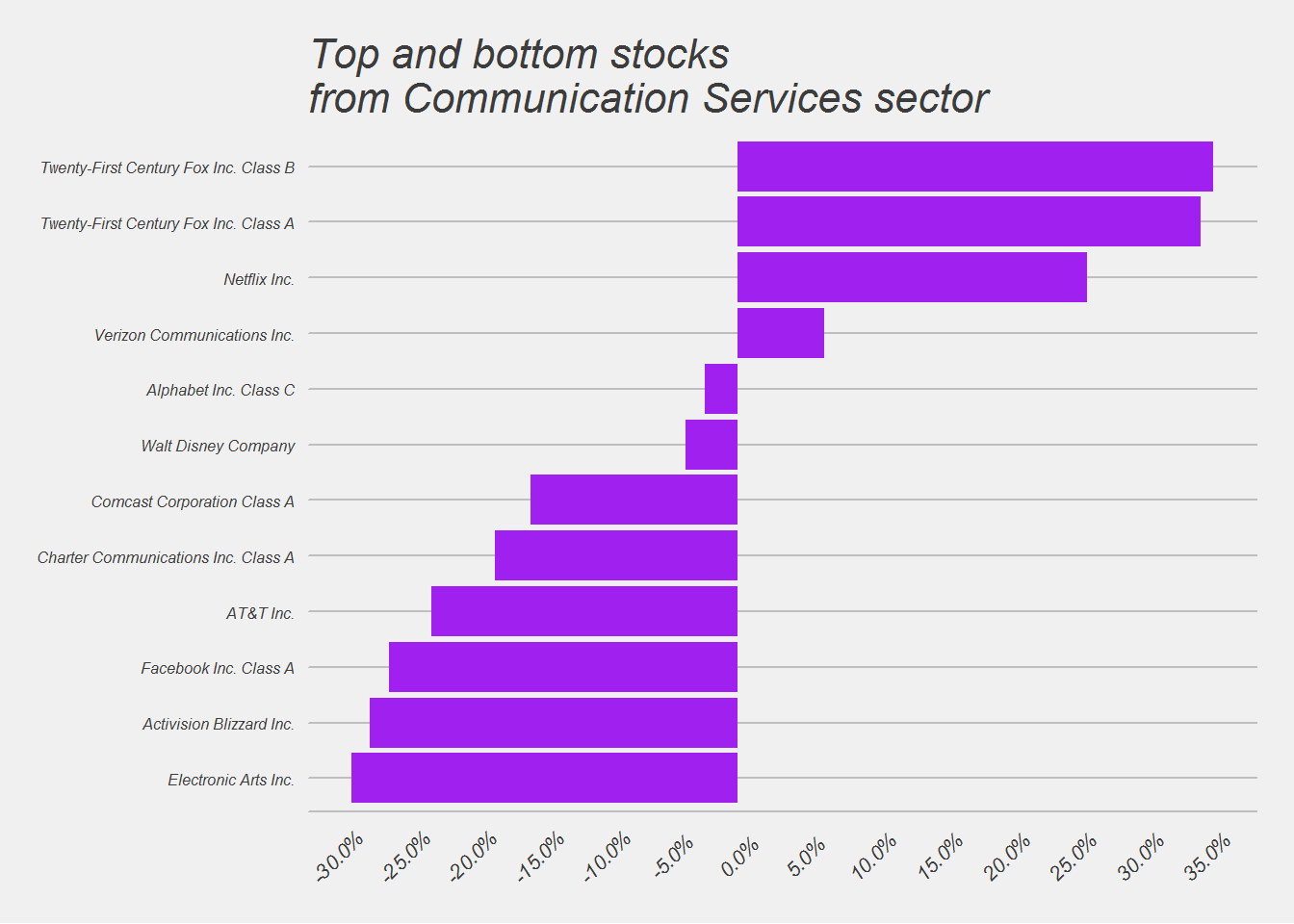
Next we will look at each sectors top and botton stocks.
Top and Bottom stocks for each Sector
## [[1]]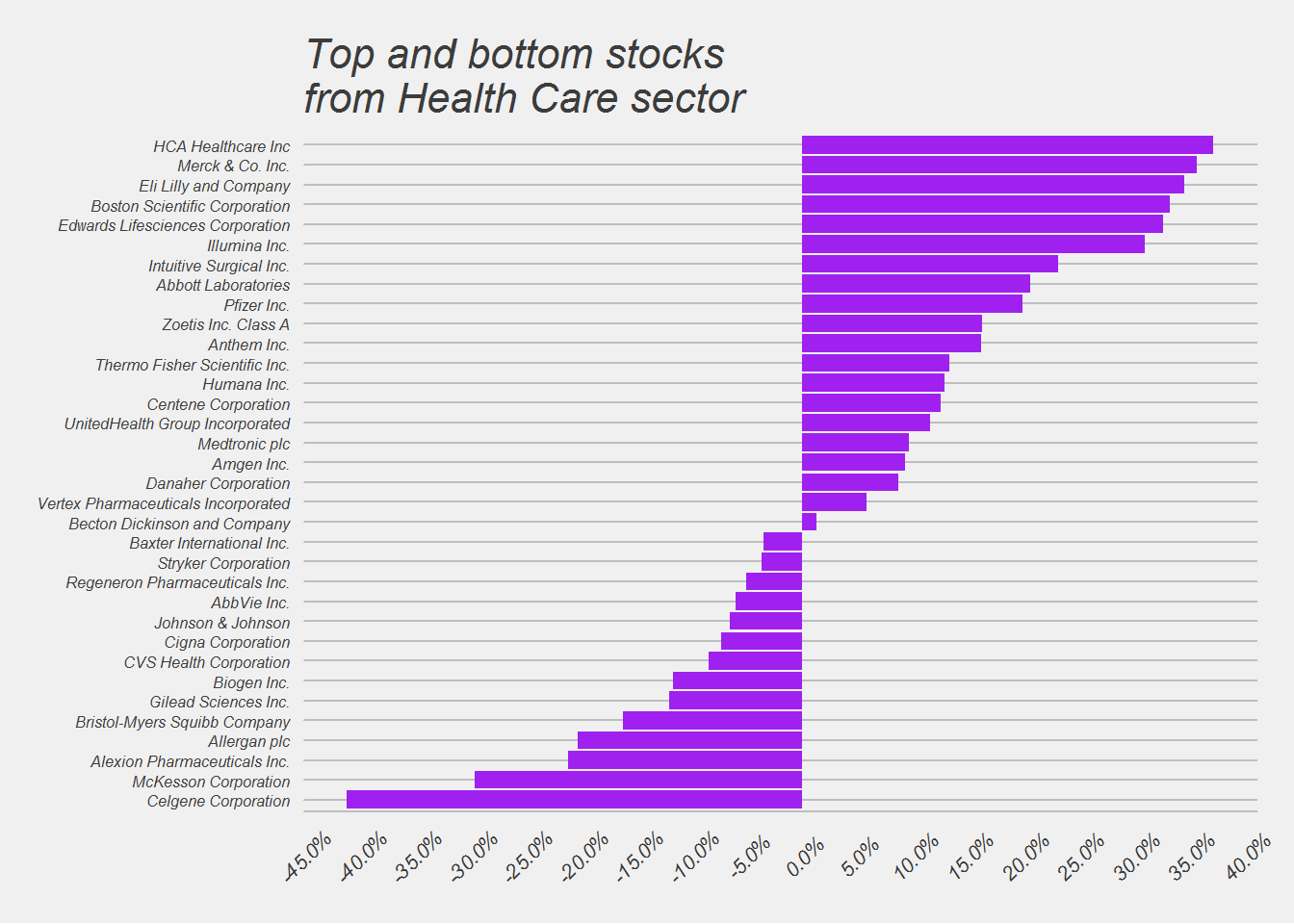
##
## [[2]]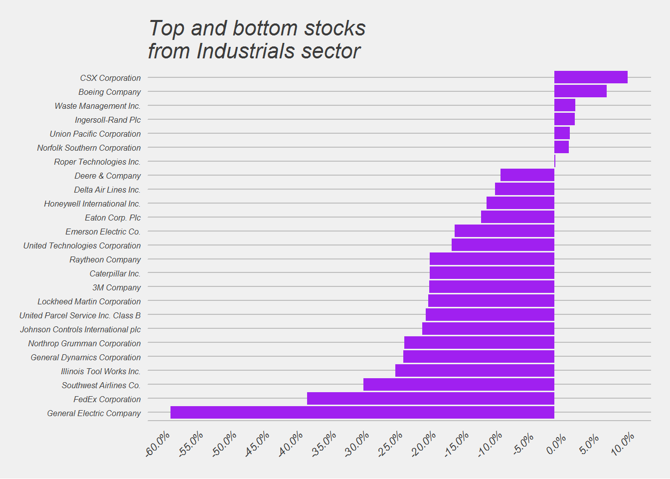
##
## [[3]]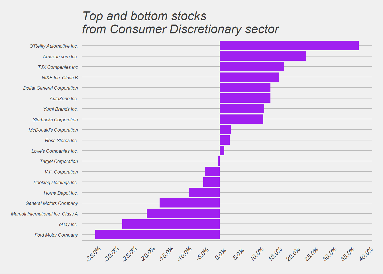
##
## [[4]]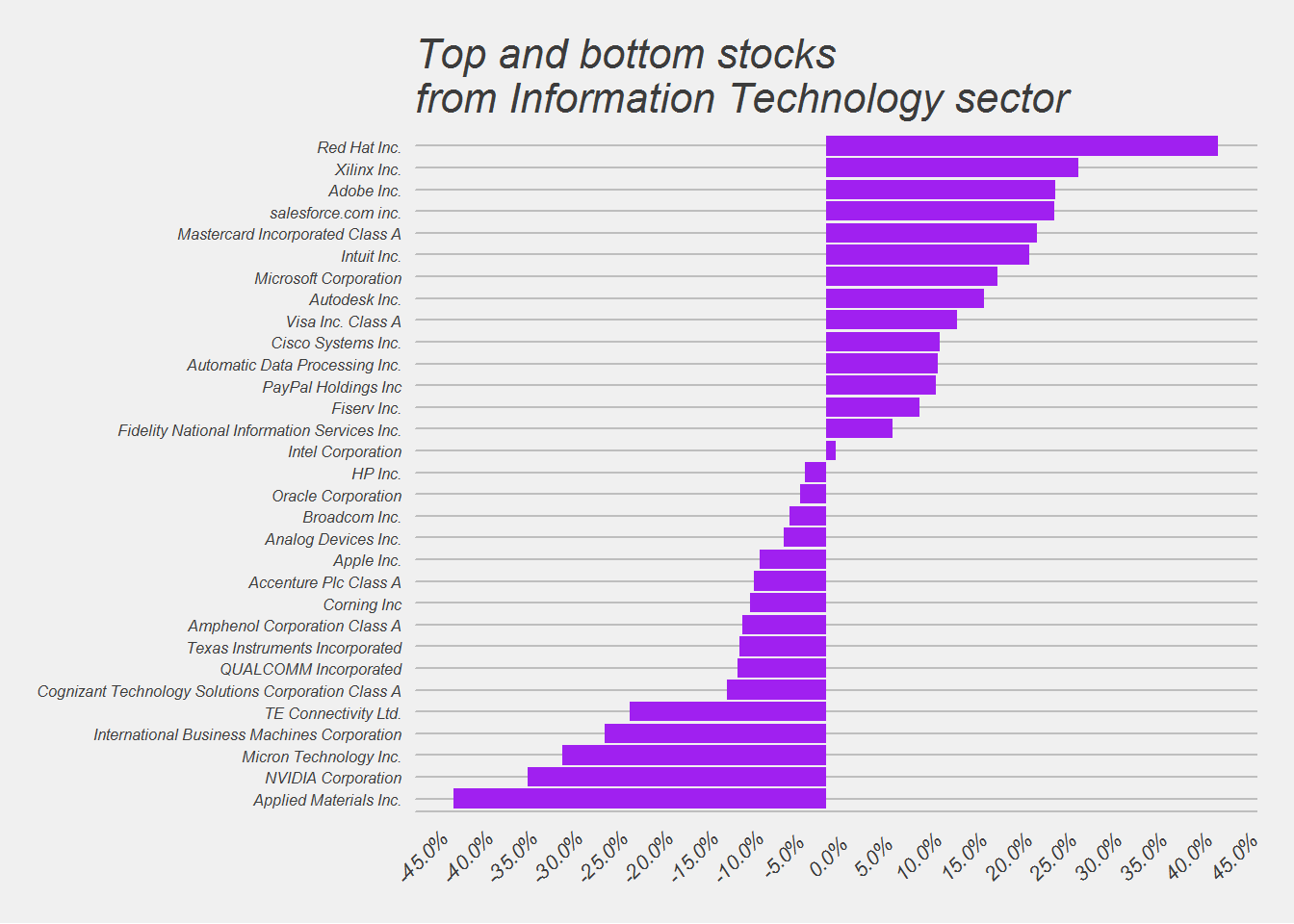
##
## [[5]]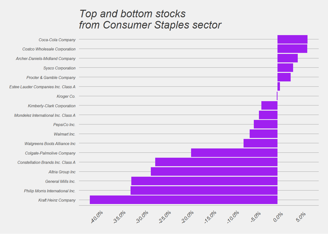
##
## [[6]]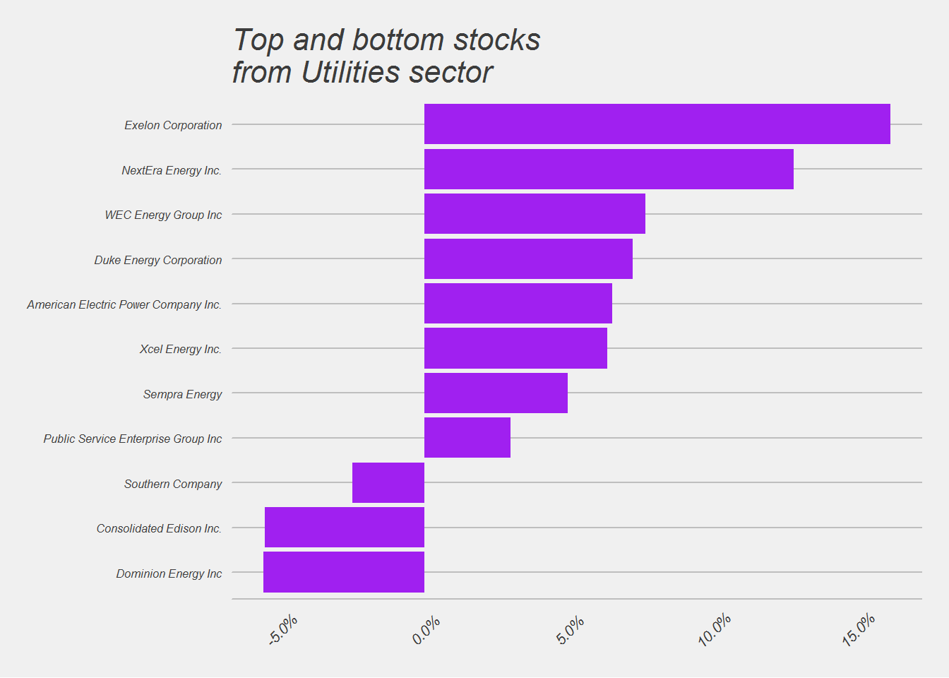
##
## [[7]]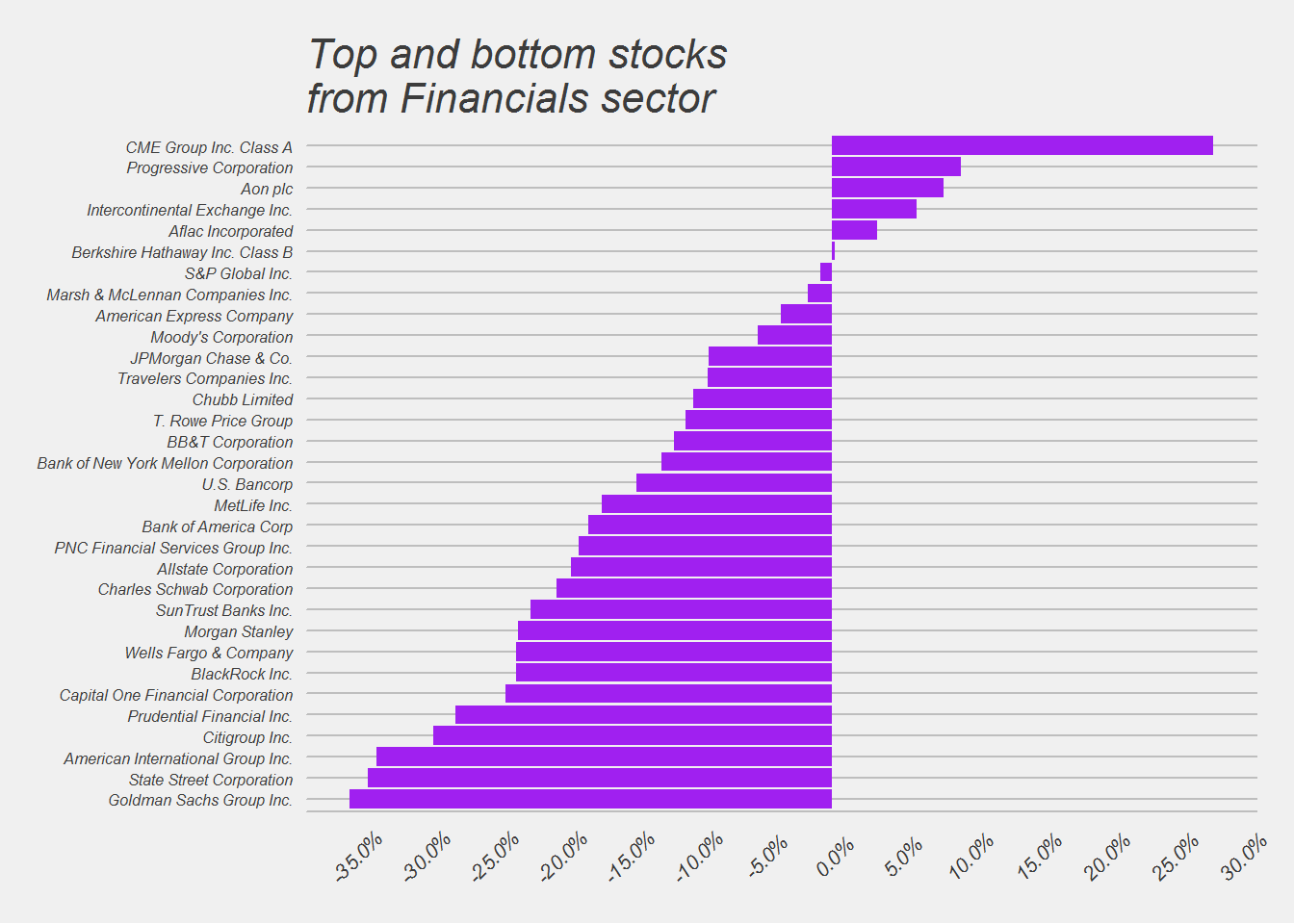
##
## [[8]]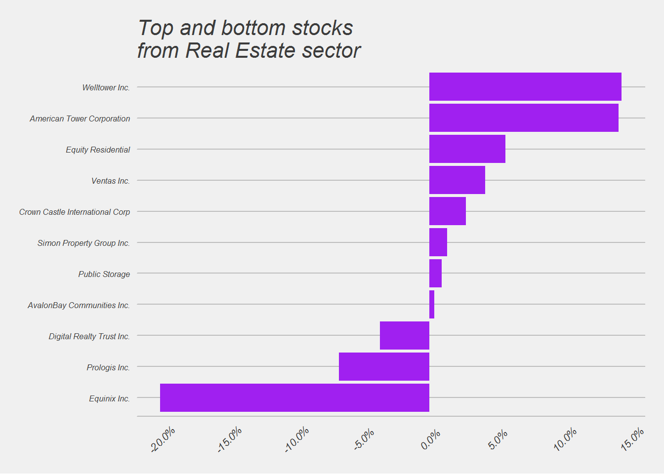
##
## [[9]]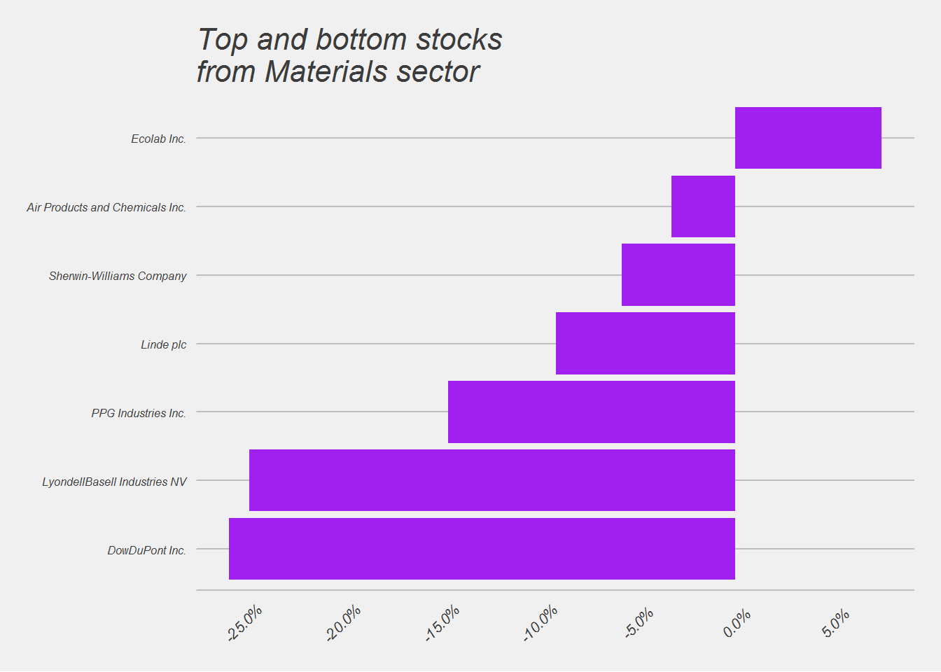
##
## [[10]]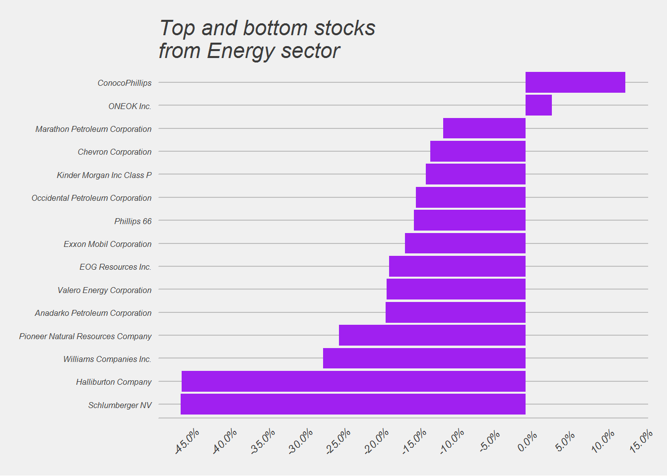
##
## [[11]]